What is an ICC Profile, do I need it?
- By BCH Technologies
- On Aug 10, 2019
- Comment 0
What is an ICC Profile?
An ICC profile (i.e. a file with .icc or .icm extension) can be considered as the “colorimetric identity card” of a peripheral and will adjust the unique way a paper should be printed on a specific printer. It helps ensure that the output has accurate colors. Many customers, after buying sublimation ink, find the final result is less than desirable, so they will ask for an ICC profile. Also, many companies publish their sublimation ICC profile. Therefore, many customers ask why BCH doesn't provide ICC profiles.
Why doesn’t BCH provide ICC Profiles for Sublimation Inks?
First of all, the ICC profile depends on the way a product is made.
For example, a regular dye ink ICC will depend on the printer's brand/model and the paper type. Therefore, we can create an ICC profile for an Epson 1430 with Generic Glossy Paper, an Epson 1430 with HP High-Gloss Paper, etc. However, the sublimation depends on the printer, transfer paper, the coating on the substrate, substrate type, press equipment, press temperature, and press time. Even with the same setting, a different variation of the operation will cause colors transferred differently. For instance, when we press the heat plate on the bottom before working, the heat comes from both the top and bottom. Otherwise, the beginning of the batch will have a different color than the later batch. As a result, a generic ICC profile is useless in most circumstances. BCH does not provide generic ICC profiles. BCH makes the ink as close to the Epson color profile as possible, and the customer can adjust the color balance with their own software.
YouTube: How to print stunting pictures without ICC
Secondly, many off-color situations are not caused by the color balance.
The Cyan, Magenta, Yellow, and Black are sublimated at a different time. If we stop the process prematurely, then some colors are not fully sublimated. For example, BCH makes super black sublimation ink. The un-sublimated ink looks browner than regular black ink. This means it needs more time to sublimate. However, black is the last color to sublimate, so if a print is pressed at a low temperature or a shorter duration, the result is an un-sublimated brownish black. Over-sublimated is not good either. Colors will de-sublimate if pressed for too long. These problems should be solved by changing the operation method, rather than using an ICC profile.
Finally, many problems can be solved without ICC.
We suggest doing three experiments before making an ICC:
1) Find out what temperature will make all the colors sublimate. We can set a time, depending on the substrate material type, which should be enough to sublimate. Let's say 75 seconds. Then, we will press at temperature 325 F, 350 F, 375F, 400F, 425 F, 450 F, or 475 F. The BCH sublimation ink is designed for 350 F to 475 F, but we should try the lower temperature too. After sublimation, we will check the residue left on the transfer paper, which will tell us the minimum transfer temperature. If there are a lot of colors left, then we should select the next temperature level.
For hard-surfaces with coatings, such as aluminum plates or ceramics, the substrate is coated. If the product looks dull and has water spots or scum when looked at from an angle, then the coating is burned and we need to decrease the temperature. If the product looks smooth (not burned) but the color is faded, then the ink is not completely transferred, and we need to increase the temperature. After an interval is decided, then we can test at 5F increments, such as 350F, 355F, 360F, etc.
2) After a temperature is set, then we can vary the time and decide how long we are going to press. We must pay attention to the coloration of the substrate material. We could transfer a perfect picture, but the substrate will be damaged due to high temperature.
Different materials will behave differently. For example, hard surfaces, for example, ceramics and aluminum, and a cloudy picture with low resolution are caused by insufficient temperature or time. While a haze around the picture indicates over-pressing. Many companies who sell blanks or coatings will give out helpful tips about how to interpret the result.
3) Most transfer papers recommend using the “plain paper” setting. However, if we set the printer to “glossy paper,” it will print with more ink volumes. Depending on what you are printing, sometimes an increased ink volume will give the transfer a better result. However, if you select photo paper, then the black is not printing from the black cartridge. It will be printed from the combination of all cartridges. If your printer is slightly off on one color, then the black will not look very accurate.
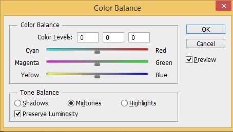
4) Now we know the best combination to transfer the colors, and we can use software like PhotoShop to adjust the tone of the picture. For example, in Photoshop, we can open the picture and go to Image->Adjustments->Color Balance (or hit Ctrl-B)